Oh great, here we go again. Another blog post about Japanese food packaging design.
But you know what? The reality is that the Japanese kick our butts many times over when it comes to intelligent, fun and groundbreaking ways to wrap something edible. Ok, so there actually are American designers at work behind the scenes from time to time, but it's often the Japanese who sees something insignificant, picks it up and turns it into something fun.
This weekend I attended a music festival in Denmark as I was designing the stage decor for a Danish pop group. I hate festivals. Too many people in too little space, including cigarettes, beer and endless gallons of freely distributed omnipresent pee. The food was in the same league so I fled the scene and found a nice little sushi place away from the madness.
And this is where I came across this lovely bottle of Japanese soda fizz
Ramune:
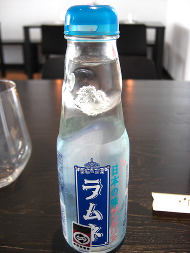
An ice marble is caught in the bottle neck, that works as an airtight bottle closer. You take it out of the freezer/fridge and push the lid down on top--the marble falls down and you can pour out the liquid.
http://www.youtube.com/watch?v=AKYZz53OqOI
According to Wikipedia, this design was invented by the American
Hiram Codd who had thought of this in 1873 (!). Patent license was granted for lots of companies, but the Japanese soda Ramune is one of the most famous users of the original concept. Ramune comes in over 30 flavours, but this was the original one--the taste is quite similar to Sprite.
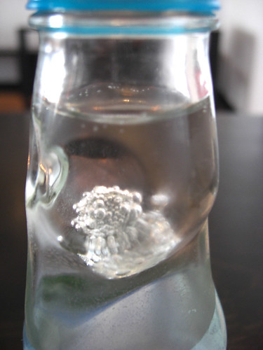 The ice marble rolls around inside, tinkling against the glass, keeping a constantly visually interesting presence in the room.
Caramel Corn
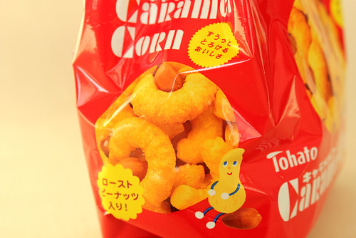
Quite well known from Japanese convenience stores, the Caramel Corn bag from the company Tohato has a distinct design. It comes in many flavours (hence the various colours) but the concept remains the same; the bag is a fat little food monster who fills his stomach with caramel corn which you can see through his circle round mouth.
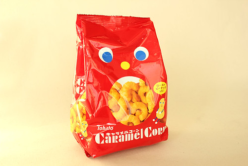
It's pure genius at work here--very simple and eye-catching, fun and weird. The bag monster looks neither happy nor sad. It just eats corn so you can tear its guts open and eat from its insides. It looks like a living thing on the shelf and brings life to the store which it inhabits.
The backside is boring though. Massive amount of listed ingredients/added crap takes up all space which in itself should be a warning sign.
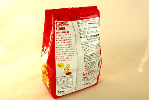
Perhaps this is why I never opened this bag to sample the corn. But this is the Packaging Whore column and taste is not the priority.
Annie's Peace Pasta & Parmesan
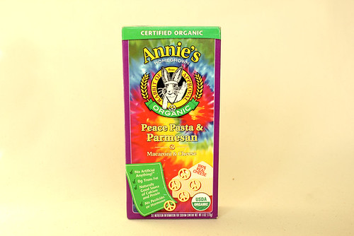
Everything with a bunny on is just adorbz, no argument there. In fact, for my next birthday I want a chainsaw with a bunny on it, the casing preferably glossy pink with pearl effect. It could also have small woolen bunnies hanging from the handle to sort of soften the aggressive, masculine look of the saw and also to act as a conversation starter if you're out in the woods and accidentally bump into a sexy lumberjack and you guys have nothing to talk about.
Anyway, back to the box which is a crazy mess of tie dye hippie hell design. This is in spite of Bernie, the "Rabbit of Approval".
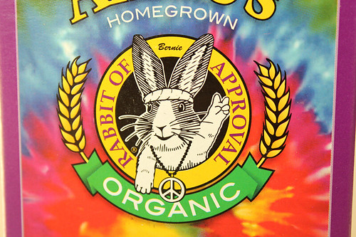
What I like about this box is the opening instructions on the side.
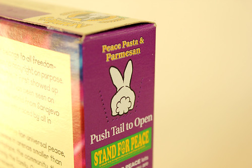
I mean, how often to you get the chance to put your finger on/inside a rabbit's butt?
Now that you ask, quite often in Denmark actually. Sex with animals is legal by law here unless you can visibly see that you're hurting the animal. There are actually farms where you can go and rent a cow for an hour for a good time. Is that weird?
This bunny is waiting for it though--how else are you going to your hands on the Peace Pasta?

Will the world be a better place when pasta is shaped like a peace sign? Will the global world leaders sit down and agree to be nice to each other? Will African military leaders stop raping children and kill everything alive after a peace session with Bernie here? Probably not. But at least they get a cool looking meal before getting back to their busy schedule of being evil.
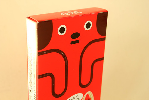
Pocky Chocolate Red Dog edition
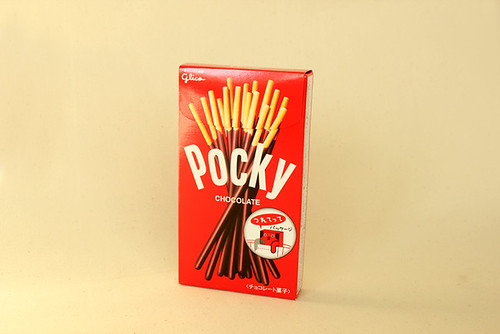
I've been saving this for months before getting the chance to post about it. So excited about this design--it is the epitome of sillyness and a great example of Japanese packaging design at its best: pointless but great fun.
"
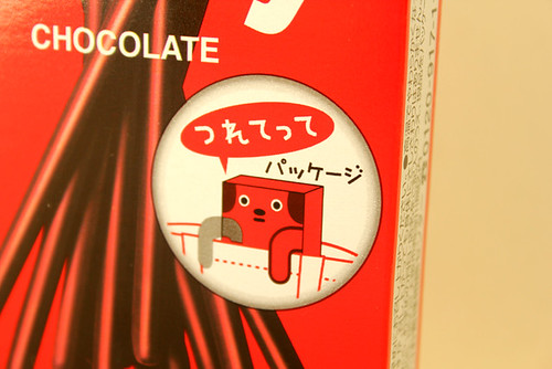
Tsurettete" (つれてって): bring me with you, the dog says. Which is what you do.
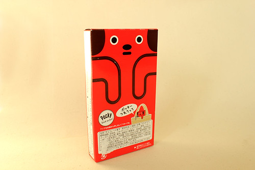
How? The back of the box has a dog on it with perforated lines along its paws so you can push them out and swing them around and out--gripping the edge of a pocket or a bag from where the dog hangs.

Ok, so why would you want to walk around with a customized Pocky bag dog looking out of your shopping basket? Well, why wouldn't you?
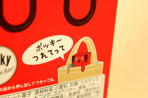
It's cool and funky--just yous and da dogg'z hanging out down the mall. What a great conversation starter when you're out walking your Pocky dog, accidentally bumping into that cute French bulldog owner from next door.
You can even offer him a bite of your Pocky.
Someday, I would seriously like to study exactly why these rice-addicted island people is so good at design. Where do they get their ideas from? Japan is such a harsh, group pressure-filled society--so from where do they develop this strength and playfulness in their work? What makes them grow up to sit in an office and create stuff that makes you think they do nothing but LSD in between their infamously long business meetings?
It's all very interesting and I might be researching more on this subject and share it with you guys in the future. You can never get enough tips about being creative.
Thank you yet again, Japan.
 Oh great, here we go again. Another blog post about Japanese food packaging design.
But you know what? The reality is that the Japanese kick our butts many times over when it comes to intelligent, fun and groundbreaking ways to wrap something edible. Ok, so there actually are American designers at work behind the scenes from time to time, but it's often the Japanese who sees something insignificant, picks it up and turns it into something fun.
This weekend I attended a music festival in Denmark as I was designing the stage decor for a Danish pop group. I hate festivals. Too many people in too little space, including cigarettes, beer and endless gallons of freely distributed omnipresent pee. The food was in the same league so I fled the scene and found a nice little sushi place away from the madness.
And this is where I came across this lovely bottle of Japanese soda fizz Ramune:
 An ice marble is caught in the bottle neck, that works as an airtight bottle closer. You take it out of the freezer/fridge and push the lid down on top--the marble falls down and you can pour out the liquid.
http://www.youtube.com/watch?v=AKYZz53OqOI
According to Wikipedia, this design was invented by the American Hiram Codd who had thought of this in 1873 (!). Patent license was granted for lots of companies, but the Japanese soda Ramune is one of the most famous users of the original concept. Ramune comes in over 30 flavours, but this was the original one--the taste is quite similar to Sprite.
 The ice marble rolls around inside, tinkling against the glass, keeping a constantly visually interesting presence in the room.
Caramel Corn
Quite well known from Japanese convenience stores, the Caramel Corn bag from the company Tohato has a distinct design. It comes in many flavours (hence the various colours) but the concept remains the same; the bag is a fat little food monster who fills his stomach with caramel corn which you can see through his circle round mouth.
 It's pure genius at work here--very simple and eye-catching, fun and weird. The bag monster looks neither happy nor sad. It just eats corn so you can tear its guts open and eat from its insides. It looks like a living thing on the shelf and brings life to the store which it inhabits.
 The backside is boring though. Massive amount of listed ingredients/added crap takes up all space which in itself should be a warning sign.
 Perhaps this is why I never opened this bag to sample the corn. But this is the Packaging Whore column and taste is not the priority.
Annie's Peace Pasta & Parmesan
 Everything with a bunny on is just adorbz, no argument there. In fact, for my next birthday I want a chainsaw with a bunny on it, the casing preferably glossy pink with pearl effect. It could also have small woolen bunnies hanging from the handle to sort of soften the aggressive, masculine look of the saw and also to act as a conversation starter if you're out in the woods and accidentally bump into a sexy lumberjack and you guys have nothing to talk about.
Anyway, back to the box which is a crazy mess of tie dye hippie hell design. This is in spite of Bernie, the "Rabbit of Approval".
 What I like about this box is the opening instructions on the side.
 I mean, how often to you get the chance to put your finger on/inside a rabbit's butt?
Now that you ask, quite often in Denmark actually. Sex with animals is legal by law here unless you can visibly see that you're hurting the animal. There are actually farms where you can go and rent a cow for an hour for a good time. Is that weird?
This bunny is waiting for it though--how else are you going to your hands on the Peace Pasta?
 Will the world be a better place when pasta is shaped like a peace sign? Will the global world leaders sit down and agree to be nice to each other? Will African military leaders stop raping children and kill everything alive after a peace session with Bernie here? Probably not. But at least they get a cool looking meal before getting back to their busy schedule of being evil.
Pocky Chocolate Red Dog edition
 I've been saving this for months before getting the chance to post about it. So excited about this design--it is the epitome of sillyness and a great example of Japanese packaging design at its best: pointless but great fun.
 "Tsurettete" (つれてって): bring me with you, the dog says. Which is what you do.
 How? The back of the box has a dog on it with perforated lines along its paws so you can push them out and swing them around and out--gripping the edge of a pocket or a bag from where the dog hangs.
 Ok, so why would you want to walk around with a customized Pocky bag dog looking out of your shopping basket? Well, why wouldn't you?
 It's cool and funky--just yous and da dogg'z hanging out down the mall. What a great conversation starter when you're out walking your Pocky dog, accidentally bumping into that cute French bulldog owner from next door.
You can even offer him a bite of your Pocky.
Someday, I would seriously like to study exactly why these rice-addicted island people is so good at design. Where do they get their ideas from? Japan is such a harsh, group pressure-filled society--so from where do they develop this strength and playfulness in their work? What makes them grow up to sit in an office and create stuff that makes you think they do nothing but LSD in between their infamously long business meetings?
It's all very interesting and I might be researching more on this subject and share it with you guys in the future. You can never get enough tips about being creative.
Thank you yet again, Japan.


Comments (6)
I’ve seen a lot of your packaging whore posts, and my question is, how many of them do you have stocked up in your attic, where expiration date was 5 years ago, and what are you going to do with them? And what do you mean by “in Denmark, it’s legal to have sex with animal as long as they are not visibly hurt”? If their scream sounds like a moan, it’s ok, but if they bite you, it’s not ok or something? Please explain, if possible, with visual aids.
Yamahomo: I used to collect Japanese packaging, my cabinets are full of expired cartons of weird unedible crap found in a Lawson between the years of 2005-2009. I am always ready for another Packaging Whore post to fall back on.
Warning! Bad stuff coming up next!**Regarding animal sex, I think people are supposed to stop if one or more orifi start bleeding or yes, if you can clearly see that the animal is not having a good time. Denmark is very liberal, we are Christian but not very much and we don’t have this heavy burden of sin which seems to fall upon anyone American. Stuff that doesn’t have to be illegal out of pure neccessity is therefore not.
http://www.icenews.is/index.php/2008/05/20/animal-brothels-legal-in-denmark/
But you know what? Seeing people in the States walking and talking about their pets all the time makes you almost wish they could jump in bed with them to sort of get it over with. It sometimes looks like that is exactly what they would want to do if they had the chance (snuggling, kissing, licking, sleeping in the same bed, talking to them, watching TV, eating – just fuck and get it over with!!)
Can you imagine a couple fighting over cheating?
husband: “honey, I am so sorry I cheated on you”
wife(or husband): “WTF! I can’t believe you did such a horrible thing! Who was it? A prostitute, or a neighbor??!!”
husband" well, it was Biscuit, our neighbor’s bulldog"….
wife(or husband): “Phew, that’s ok, as long as it wasn’t with a human”…
This conversation has taken a really gross turn.
This reminds me of the play I saw on Broadway many years ago, THE GOAT, by the great Edward Albee.
http://en.wikipedia.org/wiki/The_Goat:or,_Who_IsSylvia%3F
Great post! I agree that the Japanese do create some pretty innovative Food Packaging design concepts. Not all would “translate” succesfully for our supermarket shelves though…