We all know how even the saddest piece of stale-ass bread can taste so good when we're out in nature, hungry after a walk and enjoying the snack with friends and the singing birds.
When you talk about umami, it's not just about the flavours in your mouth. It's just as well about all the other things going on at that very moment you choose to stuff your face: the temperature, the light, the company, the time of day--and very much your surroundings. That's why I write about style, design and aesthetics for this blog, because eating isn't just eating.
The second your eyeballs fall on a piece of food--say a freshly-baked, steaming-hot slice of blueberry pie with a squirt of creme fraiche on the side--your brain is already eating it. Looking at food creates an instant and very real imagination of eating it in your brain. Science has proven that endorphins are released into your system just by looking at food, making you feel great despite that fact that you haven't even placed a single blueberry on your trembling tongue yet.
This of course means that making eatables look good lures people into eating it. But it also means we think in terms of the entire picture, and even if the food looks great but your tables are dirty and your wallpaper looks like s*#!, not that many people will sit down and eat. You have to make it all work: tell a story, lure people in with smells and visions, present your meal with dignity.
So, what do you do at home? Well, you set the table nicely. You need your guests to feel at home the minute they take off their coats, and you need them to love your food the minute you present it.
The gays, the Japanese and the housewives have known this for centuries. The Martha-loving homos like their food served on good china with a vase of freshly bought flowers next to them, the Japanese have practiced aesthetic masturbation on nearly every element in their lives (including the
wabi sabi table look), and the housewives have nothing else to do but take good care of the house, so naturally they want to master the art of dining. All of the above take much pride in taking this activity seriously.
Last week I attended a historical exhibition about table-setting through the last five decades at the
Royal Copenhagen flagship store in central Copenhagen.
Five tables were set with many different Royal Copenhagen dinnerware collections: plates, bowls, glassware, and featuring other Danish designs from the periods like table cloth, chairs, cutlery, etc.
Let's take a walk.
1960s
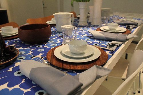
Bam! Amazing. This is so timeless, it could've been a shoot for
Wallpaper magazine, 2011.
Imagine, it's the mid-1960s (circa Mad Men Season 4) and people are meeting up at home for couple dinners and small talk. The 60s is a period of wealth, uprising and good times in Denmark. The middle class are doing well and are now able to afford a nice house, a car and lots of material things. 1968 hasn't happened yet, porn is still illegal (made legal in Denmark in 1969 as the first country in the Western world, yo!) and the hippies are still in elementary school.
Tablecloth by Marimekko; dinnerware is
Blåkant ("Blue Edge) by Grete Meyer for Royal Copenhagen; chairs by Arne Jacobsen.
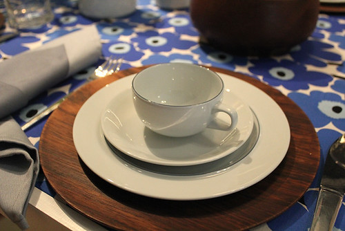
Notice the typically Scandinavian elements: natural colours, lots of wood, clean functionality. I'd sit down and drink that coffee right now.
1970s

The hippies have arrived, and they divide and conquer--even on the far lands of the vikings. Pop culture explodes and so begins the rebellion against the square bourgeois middle class. The hippie mentality--inspired by nature and a relaxed way of life--breeds flashy colours and plastic galore.
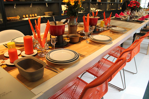
Chairs by Verner Panton; dinnerware by Anne-Marie Trolle for Royal Copenhagen (1975).
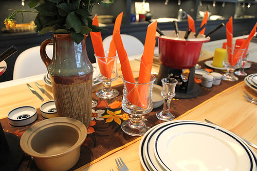
Porcelain is out; stoneware and crazy glassware are in. Notice the certain "plumpness" in the table products, for example the glasses which are more "the local Country Inn" than they're elegant, slim funky counterparts from the 1950s.
This is during my very early childhood and it's funny how these things made me barf later on in life when I came by a stoneware kitchen pot, repulsed by the heaviness, lack of taste and its "thrift store quality".
Now, I adore this look, and you actually see stoneware coming back very much in all the hot hot interior magazines. It's all about the combination of of all this dishware, placing stoneware next to something clean and modern etc.
I'm currently attending ceramic school and am working on stoneware dinner settings and several other products for the table inspired by the earth, its volcanic soil and the 1970s.
Notice the fondue pot in the middle of the table--a typical 1970's dinner feature. This was the time of true communal living: the collective, shared sex rooms (and partners). No more caged housewives. Now it's time for the man to enter the until now forbidden area: the kitchen. And for dinner parties, it's a pot luck, a mutual cooking experience. Or maybe just a another
key party.
Below: Botanical and plant-inspired stoneware with wooden details: 90% of people across the globe would scream and run for the hills if this was placed on their doormat.
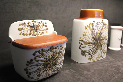
I'd be psyched, though. I adore it.
Spice jars. Adorable, no?
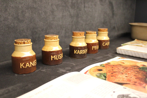
Really, aren't they?
Smørplatter is a small plate to butter your bread before placing it on your dinner plate.
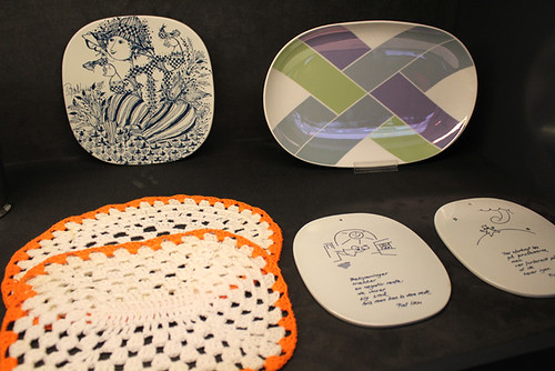
Top left one is by world famous Danish illustrator
Bjørn Wiinblad who did many dinnerware decorations in his lifetime. The bottom right ones each containing a "gruk" - a poem by Danish writer
Piet Hein which you could read while buttering or hang it on the wall.
1980s
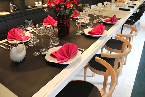
Oh, the horror.
Ladies and gentlemen, we have reached postmodern territory. A terrible misstep in the age of man.
Action causes reaction and the functionality of the 60s and the heavy stoneware of the 70' are thrown away for a new form focused style that is... just style with no content or practicality. Elements from different time periods are mixed and matched into products, furniture and buildings that look like Socrates made love to a Lego factory. And ironically enough, dinnerware from the 60s are still around today and are worth a lot, while the crap from the 80s was thrown away before 1990 had even begun. Thank God for that.
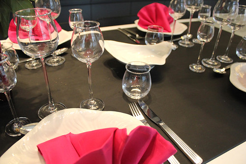
Despite the fact that this decade contains lots of unemployment, depression and poverty, it was all about looking successful and having a lot of money. Same goes for the dinner party where it's important to show your wealth through your dinner table: the expensive silverware, the trendy Phillippe Starck kitchen utensils and the designer cool glass vases. The pink/black/white was HOT. Add lots of metallic shine and glitter for effect.
This dinnerware is called "konkylie" (conch) by Arje Griegst in a sort of postmodern, neo-Rococo style from Hell.
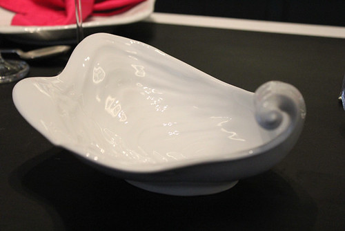
This is what a unicorn would buy for his dinnerparty in Rainbow Wonderland.
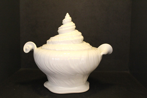
Gay.
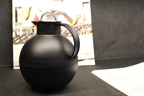
This thermo coffee dispenser was in every Dane's home (30+ colour options) until the day they realised how cheap it looked, how badly it kept the coffee warm, and for dripping everywhere.
 1990s
1990s
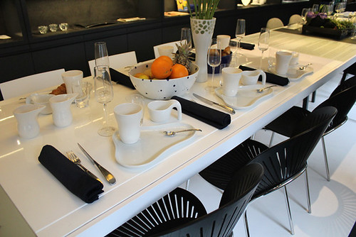
The decade of everything and nothing. The 90s was a period that didn't really have its own style. It tried to mimic the 1950s in fashion, the 1960s in functionalism, and the 1970s in organic shapes. The 80s resurrected for a moment, but we put it back to sleep asap. Basically, the 90s was just all over the place.
It was a time fascinated with the future --the rise of the internet and the event of Y2K made a big impact in people's minds. Futuristic organic forms were everywhere, as well as the new hot trend of "minimalism". It was also a period where all products had the label "designer" put before their name. "Designer furniture", "designer tableware", etc. Everything was suddenly "designed". Oh, how fancy.
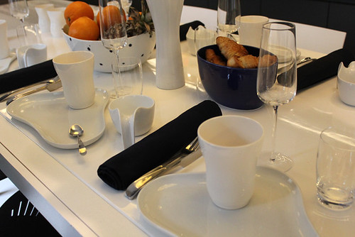
Brunch became the new super hot big city life trend. As breakfast for the late sleepers, it was a perfect way to hang out with your friends to discuss the 2 Unlimited concert the night before.
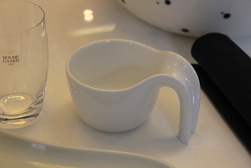
Dinnerware "Ursula" and "Ole" by famous Danish ceramic designers Ursula Munch-Petersen and Ole Jensen. Notice the sculptural, clean and playful shapes.
"Trinidad" chairs by Nanna Ditzel. Glasses by Holmegaard.
The 2000s
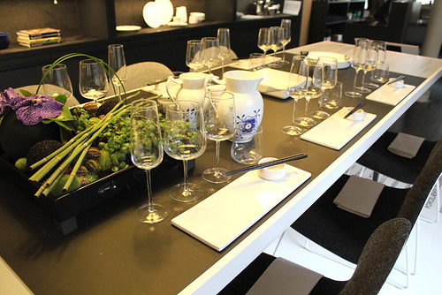
Throw out the heavy potroast, pork chops and meat balls, cause sushi has reached the coasts of Denmark. I can't believe my first taste of sushi was just 10 years ago, it was really a super exotic delicacy one had only heard about from movies like
Akira. Now in 2011 Denmark has been flooded with sushi takeaways everywhere (watch out for the Chinese-owned sushi places, they totally don't know how to cook rice!).
Like in the 1980s, the inspiration from the East once again became super hot in 2001, as well as influences from other global cultures by way of the internet. With designers becoming increasingly aware of environmental problems, the word "sustainable" became the new black in design and fashion. It was suddenly ok to relax, be aware of your body and mind and invite friends over for slow cooking and have big kitchens where everyone could sit down, talk, and maybe do a bit of yoga.
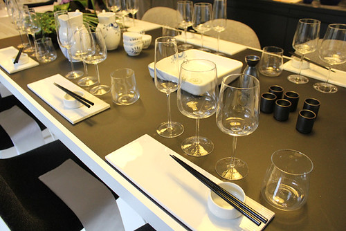
Feelings of nostalgia rose along with a need for real things free of "hip design". Designers looked back towards the classic dinnerware forms paired with a creative minimalist approach.
"Mega Mussel" dinnerware by Karen Kjældgaard Larsen and the Japanese inspired "Elements" by Louise Campbell--both based on old Royal Copenhagen designs but redone and redirected into younger territory for the new generations.
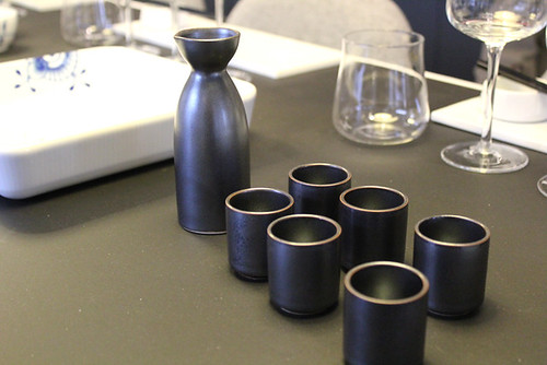
And here we are in 2011. What is the new trend on the table this decade? Will this be the decade where cooking more or less stops because people live on takeaway and Cup Noodle? Will we be spoonfed by robots at the end of 2020 anyway?
Discuss!
 We all know how even the saddest piece of stale-ass bread can taste so good when we're out in nature, hungry after a walk and enjoying the snack with friends and the singing birds.
When you talk about umami, it's not just about the flavours in your mouth. It's just as well about all the other things going on at that very moment you choose to stuff your face: the temperature, the light, the company, the time of day--and very much your surroundings. That's why I write about style, design and aesthetics for this blog, because eating isn't just eating.
The second your eyeballs fall on a piece of food--say a freshly-baked, steaming-hot slice of blueberry pie with a squirt of creme fraiche on the side--your brain is already eating it. Looking at food creates an instant and very real imagination of eating it in your brain. Science has proven that endorphins are released into your system just by looking at food, making you feel great despite that fact that you haven't even placed a single blueberry on your trembling tongue yet.
This of course means that making eatables look good lures people into eating it. But it also means we think in terms of the entire picture, and even if the food looks great but your tables are dirty and your wallpaper looks like s*#!, not that many people will sit down and eat. You have to make it all work: tell a story, lure people in with smells and visions, present your meal with dignity.
So, what do you do at home? Well, you set the table nicely. You need your guests to feel at home the minute they take off their coats, and you need them to love your food the minute you present it.
The gays, the Japanese and the housewives have known this for centuries. The Martha-loving homos like their food served on good china with a vase of freshly bought flowers next to them, the Japanese have practiced aesthetic masturbation on nearly every element in their lives (including the wabi sabi table look), and the housewives have nothing else to do but take good care of the house, so naturally they want to master the art of dining. All of the above take much pride in taking this activity seriously.
Last week I attended a historical exhibition about table-setting through the last five decades at the Royal Copenhagen flagship store in central Copenhagen.
Five tables were set with many different Royal Copenhagen dinnerware collections: plates, bowls, glassware, and featuring other Danish designs from the periods like table cloth, chairs, cutlery, etc.
Let's take a walk.
1960s
 Bam! Amazing. This is so timeless, it could've been a shoot for Wallpaper magazine, 2011.
Imagine, it's the mid-1960s (circa Mad Men Season 4) and people are meeting up at home for couple dinners and small talk. The 60s is a period of wealth, uprising and good times in Denmark. The middle class are doing well and are now able to afford a nice house, a car and lots of material things. 1968 hasn't happened yet, porn is still illegal (made legal in Denmark in 1969 as the first country in the Western world, yo!) and the hippies are still in elementary school.
Tablecloth by Marimekko; dinnerware is Blåkant ("Blue Edge) by Grete Meyer for Royal Copenhagen; chairs by Arne Jacobsen.
 Notice the typically Scandinavian elements: natural colours, lots of wood, clean functionality. I'd sit down and drink that coffee right now.
1970s
 The hippies have arrived, and they divide and conquer--even on the far lands of the vikings. Pop culture explodes and so begins the rebellion against the square bourgeois middle class. The hippie mentality--inspired by nature and a relaxed way of life--breeds flashy colours and plastic galore.
Chairs by Verner Panton; dinnerware by Anne-Marie Trolle for Royal Copenhagen (1975).
 Porcelain is out; stoneware and crazy glassware are in. Notice the certain "plumpness" in the table products, for example the glasses which are more "the local Country Inn" than they're elegant, slim funky counterparts from the 1950s.
This is during my very early childhood and it's funny how these things made me barf later on in life when I came by a stoneware kitchen pot, repulsed by the heaviness, lack of taste and its "thrift store quality".
Now, I adore this look, and you actually see stoneware coming back very much in all the hot hot interior magazines. It's all about the combination of of all this dishware, placing stoneware next to something clean and modern etc.
I'm currently attending ceramic school and am working on stoneware dinner settings and several other products for the table inspired by the earth, its volcanic soil and the 1970s.
Notice the fondue pot in the middle of the table--a typical 1970's dinner feature. This was the time of true communal living: the collective, shared sex rooms (and partners). No more caged housewives. Now it's time for the man to enter the until now forbidden area: the kitchen. And for dinner parties, it's a pot luck, a mutual cooking experience. Or maybe just a another key party.
Below: Botanical and plant-inspired stoneware with wooden details: 90% of people across the globe would scream and run for the hills if this was placed on their doormat.
 I'd be psyched, though. I adore it.
Spice jars. Adorable, no?
 Really, aren't they?
Smørplatter is a small plate to butter your bread before placing it on your dinner plate.
 Top left one is by world famous Danish illustrator Bjørn Wiinblad who did many dinnerware decorations in his lifetime. The bottom right ones each containing a "gruk" - a poem by Danish writer Piet Hein which you could read while buttering or hang it on the wall.
1980s
 Oh, the horror.
Ladies and gentlemen, we have reached postmodern territory. A terrible misstep in the age of man.
Action causes reaction and the functionality of the 60s and the heavy stoneware of the 70' are thrown away for a new form focused style that is... just style with no content or practicality. Elements from different time periods are mixed and matched into products, furniture and buildings that look like Socrates made love to a Lego factory. And ironically enough, dinnerware from the 60s are still around today and are worth a lot, while the crap from the 80s was thrown away before 1990 had even begun. Thank God for that.
 Despite the fact that this decade contains lots of unemployment, depression and poverty, it was all about looking successful and having a lot of money. Same goes for the dinner party where it's important to show your wealth through your dinner table: the expensive silverware, the trendy Phillippe Starck kitchen utensils and the designer cool glass vases. The pink/black/white was HOT. Add lots of metallic shine and glitter for effect.
This dinnerware is called "konkylie" (conch) by Arje Griegst in a sort of postmodern, neo-Rococo style from Hell.
 This is what a unicorn would buy for his dinnerparty in Rainbow Wonderland.
 Gay.
This thermo coffee dispenser was in every Dane's home (30+ colour options) until the day they realised how cheap it looked, how badly it kept the coffee warm, and for dripping everywhere.
 1990s
1990s
 The decade of everything and nothing. The 90s was a period that didn't really have its own style. It tried to mimic the 1950s in fashion, the 1960s in functionalism, and the 1970s in organic shapes. The 80s resurrected for a moment, but we put it back to sleep asap. Basically, the 90s was just all over the place.
It was a time fascinated with the future --the rise of the internet and the event of Y2K made a big impact in people's minds. Futuristic organic forms were everywhere, as well as the new hot trend of "minimalism". It was also a period where all products had the label "designer" put before their name. "Designer furniture", "designer tableware", etc. Everything was suddenly "designed". Oh, how fancy.
 Brunch became the new super hot big city life trend. As breakfast for the late sleepers, it was a perfect way to hang out with your friends to discuss the 2 Unlimited concert the night before.
 Dinnerware "Ursula" and "Ole" by famous Danish ceramic designers Ursula Munch-Petersen and Ole Jensen. Notice the sculptural, clean and playful shapes.
"Trinidad" chairs by Nanna Ditzel. Glasses by Holmegaard.
The 2000s
 Throw out the heavy potroast, pork chops and meat balls, cause sushi has reached the coasts of Denmark. I can't believe my first taste of sushi was just 10 years ago, it was really a super exotic delicacy one had only heard about from movies like Akira. Now in 2011 Denmark has been flooded with sushi takeaways everywhere (watch out for the Chinese-owned sushi places, they totally don't know how to cook rice!).
Like in the 1980s, the inspiration from the East once again became super hot in 2001, as well as influences from other global cultures by way of the internet. With designers becoming increasingly aware of environmental problems, the word "sustainable" became the new black in design and fashion. It was suddenly ok to relax, be aware of your body and mind and invite friends over for slow cooking and have big kitchens where everyone could sit down, talk, and maybe do a bit of yoga.
 Feelings of nostalgia rose along with a need for real things free of "hip design". Designers looked back towards the classic dinnerware forms paired with a creative minimalist approach.
"Mega Mussel" dinnerware by Karen Kjældgaard Larsen and the Japanese inspired "Elements" by Louise Campbell--both based on old Royal Copenhagen designs but redone and redirected into younger territory for the new generations.
 And here we are in 2011. What is the new trend on the table this decade? Will this be the decade where cooking more or less stops because people live on takeaway and Cup Noodle? Will we be spoonfed by robots at the end of 2020 anyway?
Discuss!


Comments (5)
Very cool exhibition. I’m going to see that. What will be the trend this decade? I’m not much of a first mover within table decoration, so I hope somebody here could post ideas and links for reference. Where is it going?
My least favorite is definitely 70s look.
I enjoyed this post very much, thank you for such an in-depth report!
God I love Marimekko.
I actually don’t think the aesthetics of dining will change so much going into the future. We keep borrowing from the past. Although I do think counter/ bar eating is really making its mark here. It’s my favorite way to dine, for sure.
I thought the 1960s one was the most modern! Marimekko is really timeless.
OMG I was dying laughing reading. I can’t wait to hear your commentary on Vegas. I missed you and Umamimart!