When visiting Chicago for the
first time last year, I of course had
Intelligenstia Coffee as a must-go destination. Sure, they've got a super spiffy space in Venice (LA) now, but Intelligentsia originally hails from Chi-town, so I wanted to make sure to stop by. This is when I discovered artist Timothy Breen.
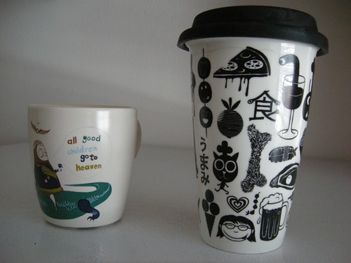
 I saw this cup, and had to have it. I ended up buying all seven that they had in stock. I figured I would disperse them between friends as gifts--it is one of a kind, a unique, smaller-sized cup, and the design is so playful. "All good children go to heaven," it says, and the Intelligentsia logo nonchalantly floats above the figure. I simply adore it--it was even featured in Juxtapoz mag!
When Yoko and I started brainstormed ideas for our
Umamimart mug, we immediately thought of this cup. Could we do something similar? We had no idea how to go about putting a design on a cup though, and ran into many walls trying to figure it out.
With a little digging, I figured out that Timothy Breen was the one who created the cup design, and I reached out to him for advice. He was so gracious and shared a ton of info with me as to how he went about executing his mug project for Intelligentsia. In many ways, our mug, designed by
Anders Arhøj, is indebted to Timothy and his immense helpfulness.
They make a cute couple, no?
 Since then, Timothy and I have stayed in touch, and he recently sent me a box of fancy Gyokuro tea, that Intelligentsia had just released. Officially, this is called "Intelligentsia Reserve Teas: Precious Jade Dew (Gyokuro)":
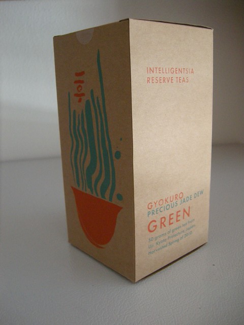
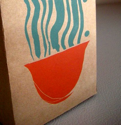
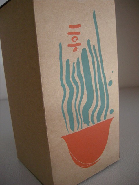
It is one in a line of five specialty teas that Intelligentsia has released. Timothy worked with another graphics person at Intelligentsia to come up with this design. I love the minimal look of it: the bright orange and turquoise color combination, the brown box, the sparse font. It is excellently packaged.
Here's Timothy on how he came up with the packaging for this tea:
My inspiration for these packages starts with the tea itself. I will usually drink some with our tea buyer to get a sense of thedrinks personality; if its aggressive or deep in flavor, bright or sweet. those things can easily translate into color and form.
The Gyukuro was so savory and enveloping, hypnotizing almost, like swimming through a kelp forest. For the whole set I needed to create a design that was immediately recognizable as an Intelligentsia Reserve but could serve as a vehicle for evolving psychedelic imagery. I like the idea of releasing a stream of products in little batches that never look exactly the same.
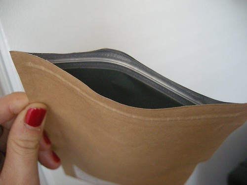
Traditional tea pouch with zipper seal for freshness.
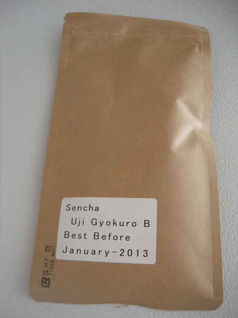
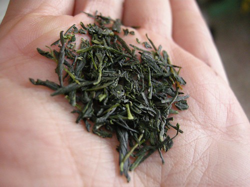
This was harvested in Spring 2010, in Uji (Kyoto, Japan).
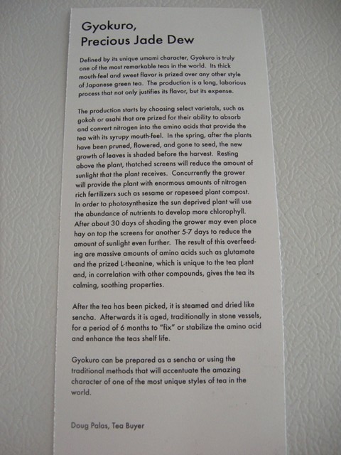
 Gyokuro is considered to be the supreme type of green tea. I'll let you read about it here, in the insert that came in the box (click to enlarge). They use the word UMAMI!
Yoko showed us how to prepare sencha,
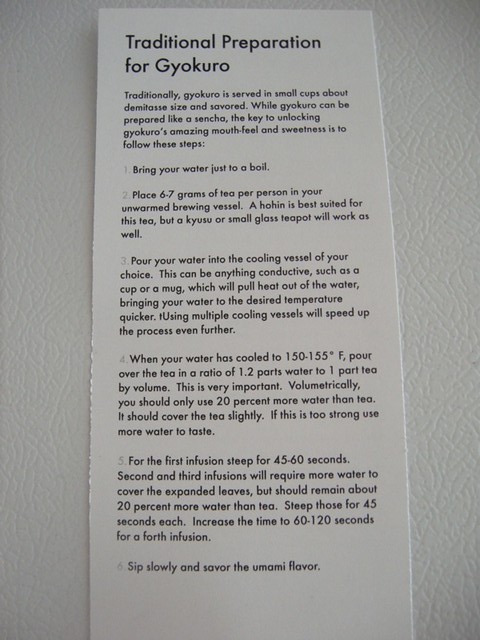
remember? Here's what Intelligentsia suggests to prepare their Gyokuro.
It interests me how Western companies try to market and brand teas from the Far East. While many end up with cheesy branding (oh, you know, "The Orient"), Timothy nailed this--his design is whimsical, modern and understated.
As for the tea itself, it is vegetal, savory, deep. Straight Umami!
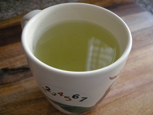
Thanks Timothy for the tea! Cheers!
 When visiting Chicago for the first time last year, I of course had Intelligenstia Coffee as a must-go destination. Sure, they've got a super spiffy space in Venice (LA) now, but Intelligentsia originally hails from Chi-town, so I wanted to make sure to stop by. This is when I discovered artist Timothy Breen.
 I saw this cup, and had to have it. I ended up buying all seven that they had in stock. I figured I would disperse them between friends as gifts--it is one of a kind, a unique, smaller-sized cup, and the design is so playful. "All good children go to heaven," it says, and the Intelligentsia logo nonchalantly floats above the figure. I simply adore it--it was even featured in Juxtapoz mag!
When Yoko and I started brainstormed ideas for our Umamimart mug, we immediately thought of this cup. Could we do something similar? We had no idea how to go about putting a design on a cup though, and ran into many walls trying to figure it out.
With a little digging, I figured out that Timothy Breen was the one who created the cup design, and I reached out to him for advice. He was so gracious and shared a ton of info with me as to how he went about executing his mug project for Intelligentsia. In many ways, our mug, designed by Anders Arhøj, is indebted to Timothy and his immense helpfulness.
They make a cute couple, no?
 Since then, Timothy and I have stayed in touch, and he recently sent me a box of fancy Gyokuro tea, that Intelligentsia had just released. Officially, this is called "Intelligentsia Reserve Teas: Precious Jade Dew (Gyokuro)":
 It is one in a line of five specialty teas that Intelligentsia has released. Timothy worked with another graphics person at Intelligentsia to come up with this design. I love the minimal look of it: the bright orange and turquoise color combination, the brown box, the sparse font. It is excellently packaged.
Here's Timothy on how he came up with the packaging for this tea:
My inspiration for these packages starts with the tea itself. I will usually drink some with our tea buyer to get a sense of thedrinks personality; if its aggressive or deep in flavor, bright or sweet. those things can easily translate into color and form.
The Gyukuro was so savory and enveloping, hypnotizing almost, like swimming through a kelp forest. For the whole set I needed to create a design that was immediately recognizable as an Intelligentsia Reserve but could serve as a vehicle for evolving psychedelic imagery. I like the idea of releasing a stream of products in little batches that never look exactly the same.
 Traditional tea pouch with zipper seal for freshness.

 This was harvested in Spring 2010, in Uji (Kyoto, Japan).
 Gyokuro is considered to be the supreme type of green tea. I'll let you read about it here, in the insert that came in the box (click to enlarge). They use the word UMAMI!
 Yoko showed us how to prepare sencha, remember? Here's what Intelligentsia suggests to prepare their Gyokuro.
 It interests me how Western companies try to market and brand teas from the Far East. While many end up with cheesy branding (oh, you know, "The Orient"), Timothy nailed this--his design is whimsical, modern and understated.
As for the tea itself, it is vegetal, savory, deep. Straight Umami!
 Thanks Timothy for the tea! Cheers!


Comments (1)
I love that they have tea now! Don’t forget, there’s also an intelligentsia in silverlake, which was their first LA location. A lot of different coffee shops around here like Paper & plastik are serving their coffee too.